The Project
The Yahoo Sports app had become cluttered and disorganized over time, lacking a centralized design system. Additionally, the app’s outdated aesthetic needed a serious facelift. With this full redesign, we aimed to clean up years of design inconsistencies and create a new design system to enable rapid iteration.
My Role
As the project’s lead, I managed the team in redesigning every component from the bottom-up, working closely with PMs and management to meet business and user needs. My advocating for the project was crucial to its prioritization, and following its launch, I was promoted to become our team’s Design Lead.
The Outcome
This redesign was hugely successful, skyrocketing the Yahoo Sports app’s NPS score from -12 to 58, the highest score in the company. We accomplished our goal of bringing a unique energy and fan voice into the product, separating us from competitors. Additionally, our work heavily influenced Verizon Media’s newest design system.
Highlights & Key Features
Home Page
Goal
To create a beautiful and personalized home for sports fans to catch up with their favorite teams and consume exclusive video and article content
Outcome
DAUs increased by +46%
Home tab video streaming increased by 3x
Articles read per user per day increased from 2.3 to 4.1
Pregame Page
Goal
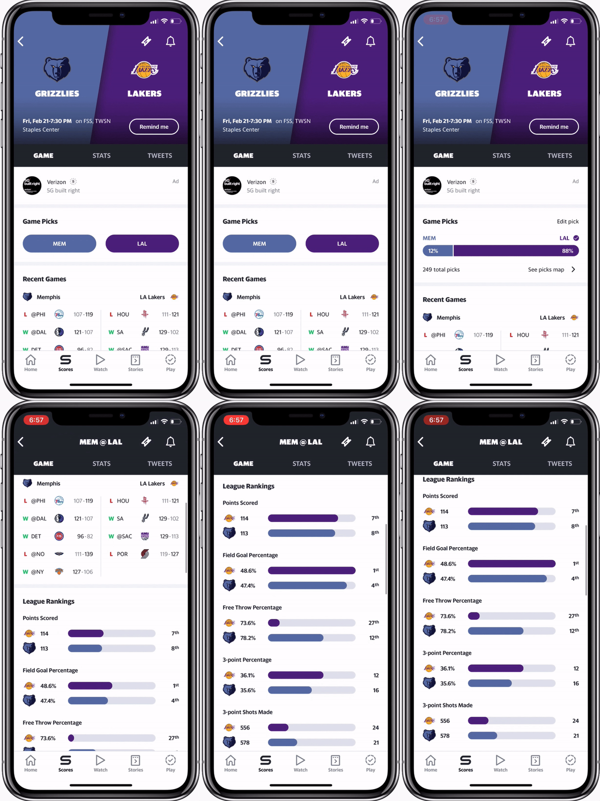
To highlight fandom through the use of team colors, data visualization and animation
Outcome
In beta testing, 62% of users preferred the new design and 81% of those users specifically thought it looked more attractive, clean, and modern
“I love the new feel of the app. It’s cleaner, sleeker, and smoother. It feels like it’ll just glide across my screen versus skip.” - Anonymous beta user
Live Game
Goal
To re-energize the live game experience with a redesigned play-by-play visualization
To make following a live game more engaging through a simplified information hierarchy, enabling users to easily find key stats
Outcome
Page visits increased by +56% after launching the redesign
Watch Tab
Goal
To infuse excitement into live games and original shows
To improve discoverability of our breadth of video content
Outcome
Increased number of unique users by +59% and watch time by +26%
The Process Explained
How did we get here?
By 2017, the app’s look and feel had become increasingly dated, but more importantly, it had grown quite messy; designers had come and gone without aligning to a single source of truth, ultimately riddling the product with inconsistencies. To cite a few (shown in blue):
Varying ways to display the game score in the header
Multiple types of module separators
No established team/player logo sizes or formats
Lord knows how many font weights, sizes, and colors
As a result, our product velocity suffered, with design and engineering ‘reinventing the wheel’ with every new feature. Recognizing the problem, I championed a solution: a new, meticulously documented design system with an updated aesthetic. However, a seemingly endless list of 2018 business goals meant convincing a lot of stakeholders this was worth the investment.
Stakeholders, Come Aboard!
Rallying stakeholders behind the change was the most difficult and rewarding part of the initiative. I knew we had an already packed roadmap and countless business priorities. How would I justify these immense efforts to leadership, engineering, and product teams to get them behind the redesign?
I started by collecting screens to illustrate the existing design issues. But, as every designer knows, an idea is never quite captured without mocks. So, I used my evenings to mock up key screens in a refreshed state to convey a redesign’s full potential. After a few design critiques with my extended design team, I had developed a game plan with support from my fantastic manager:
Step 1: Created a deck outlining three core issues the app faced if we continued in our current state and showcased redesigned screens
Step 2: Presented the deck to design leadership to sell this need and seek their support in pushing it forward
Step 3: Presented the deck to the other key parties: product leadership, team product managers, and engineering
Step 4: Partner with product and engineering leads to best phase the redesign into the roadmap


